As the Creative Director at Symbio, I led a multidisciplinary creative team responsible for brand, product and marketing initiatives. We worked to develop and deploy creative solutions at every possible touchpoint from identity, brand, and guidelines, to office spaces and interiors, as well as design for events and UX for customer facing product releases.
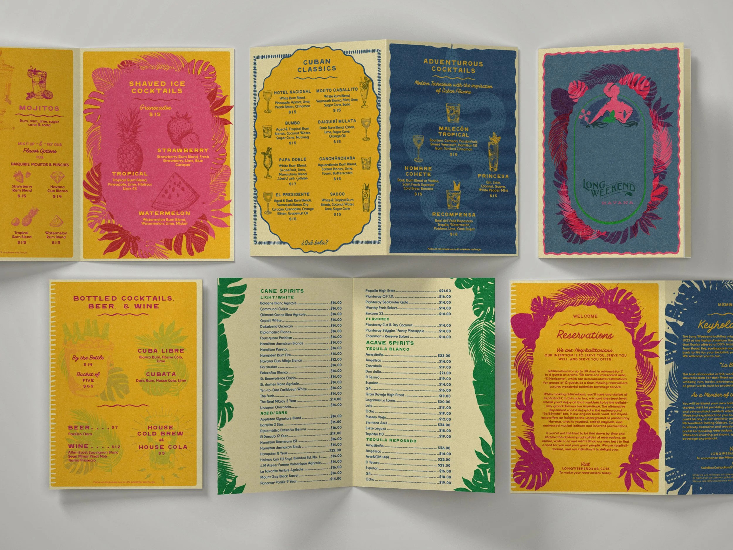
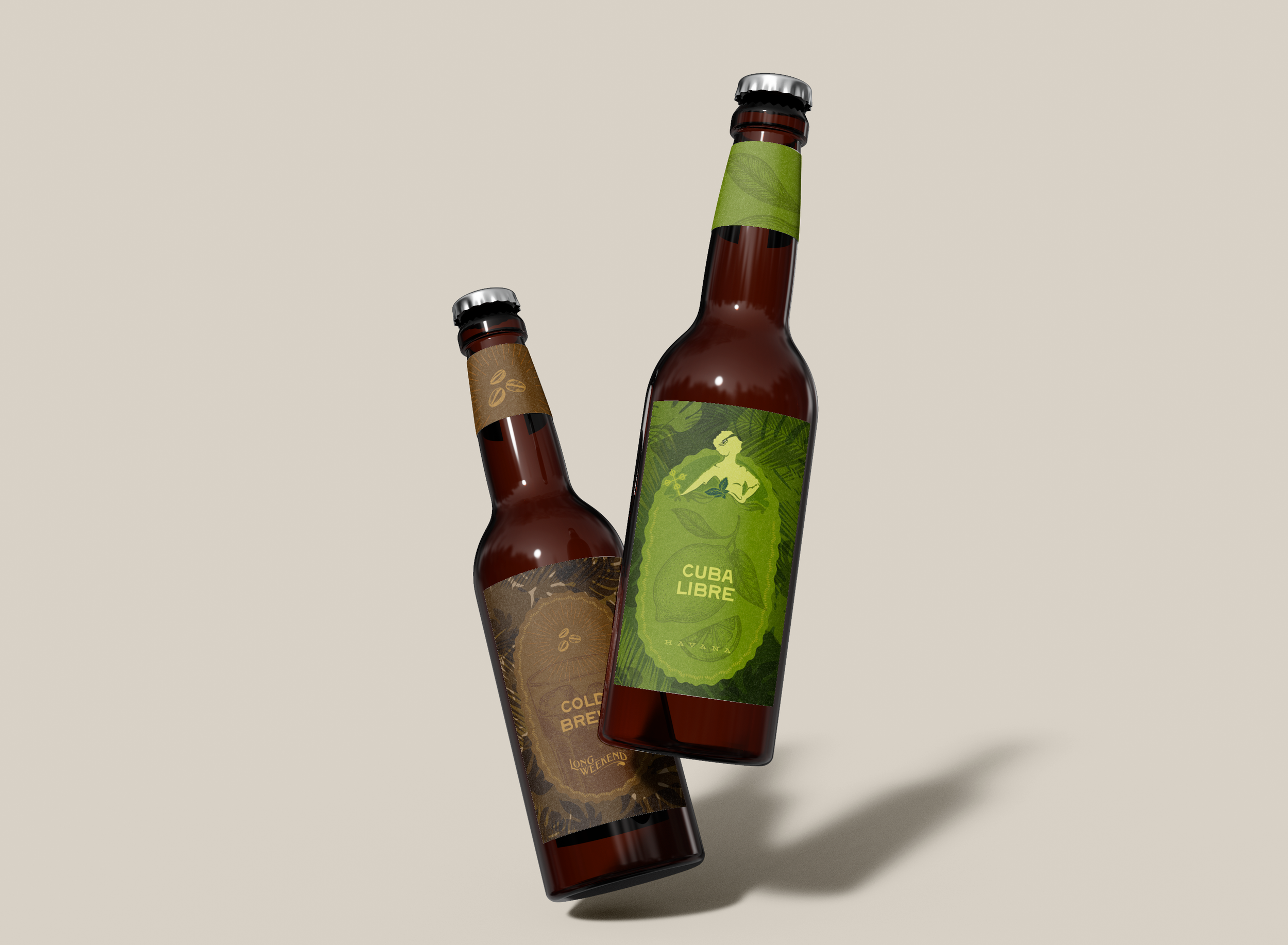
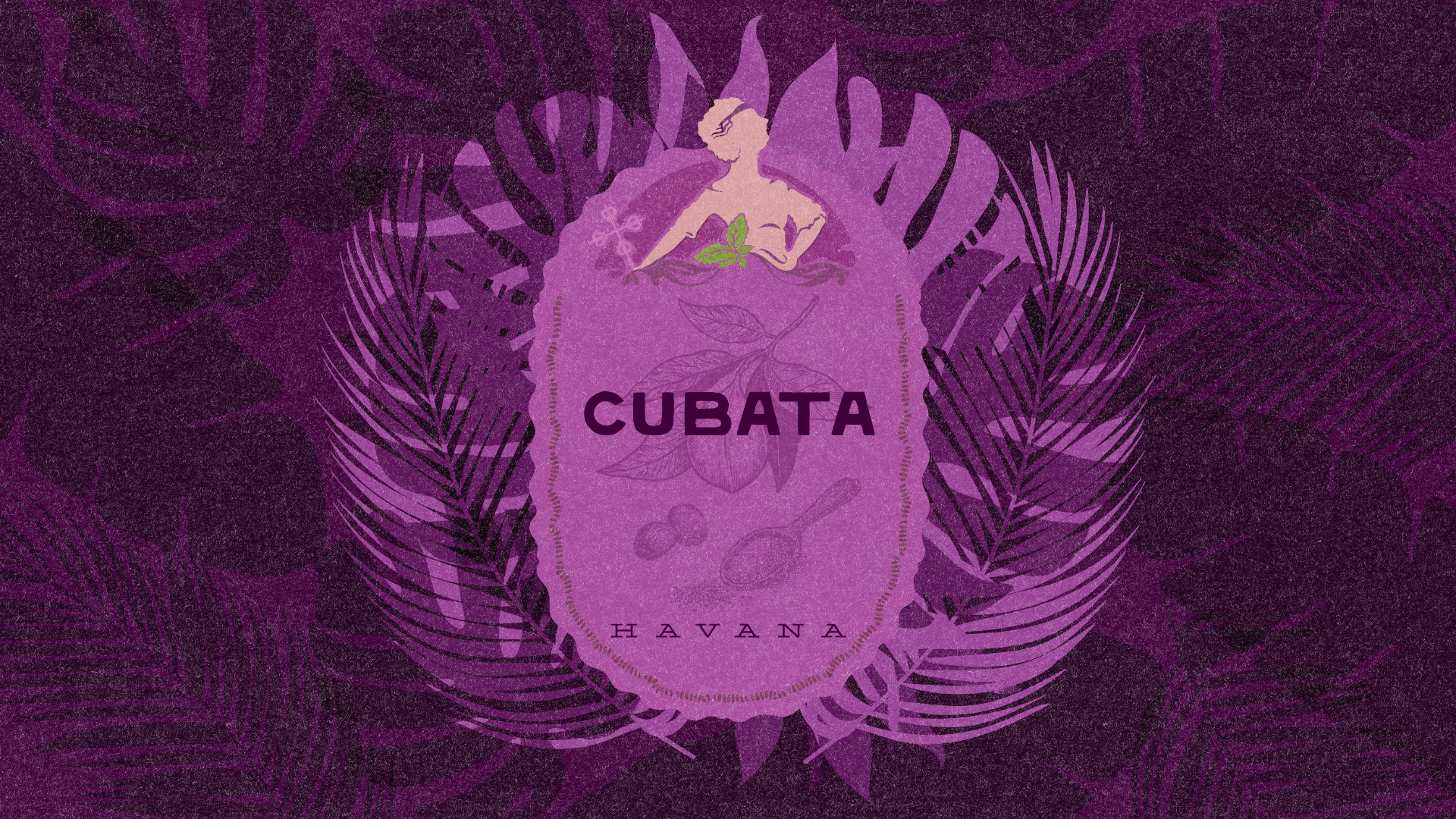
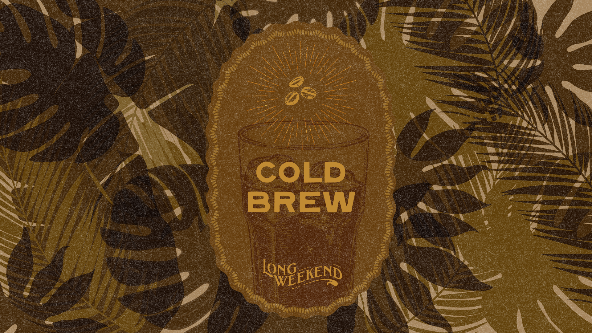
The Long Weekend is a unique cocktail bar located in an historic 1920’s bank building at the corner of Columbus and Broadway in North Beach, San Francisco. The bar offers a dynamic cultural experience, changing its theme every nine months to showcase a different destination. The first iteration of Havana included festive collateral design and illustration to pair with the vivacious interior.
A cookbook inspired by the chaos of cooking while under the influence of parenting. This whimsical collection pairs beloved recipes with artwork by artist Tucker Nichols. Equal parts cookbook, keepsake, and celebration of family life, it captures the humor, creativity, and occasional messiness of making—and sharing—food with kids.
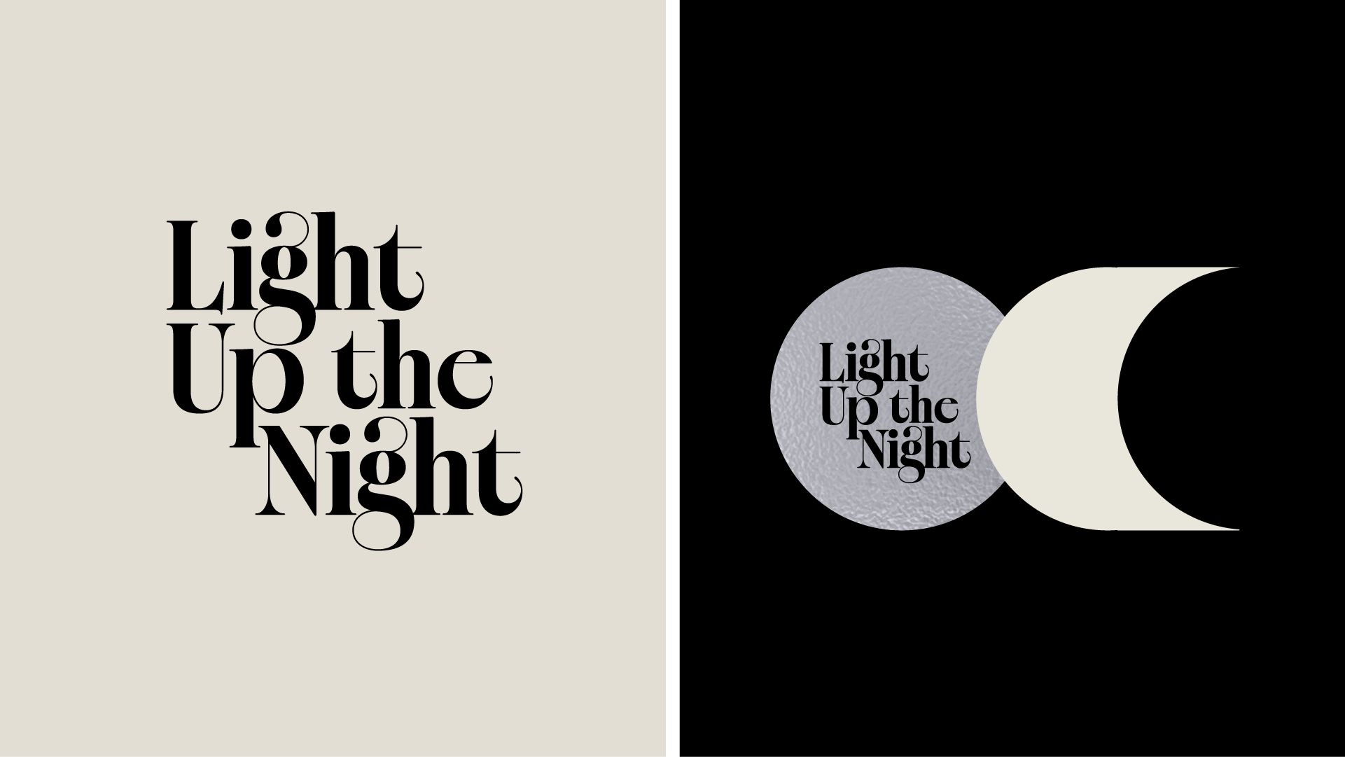
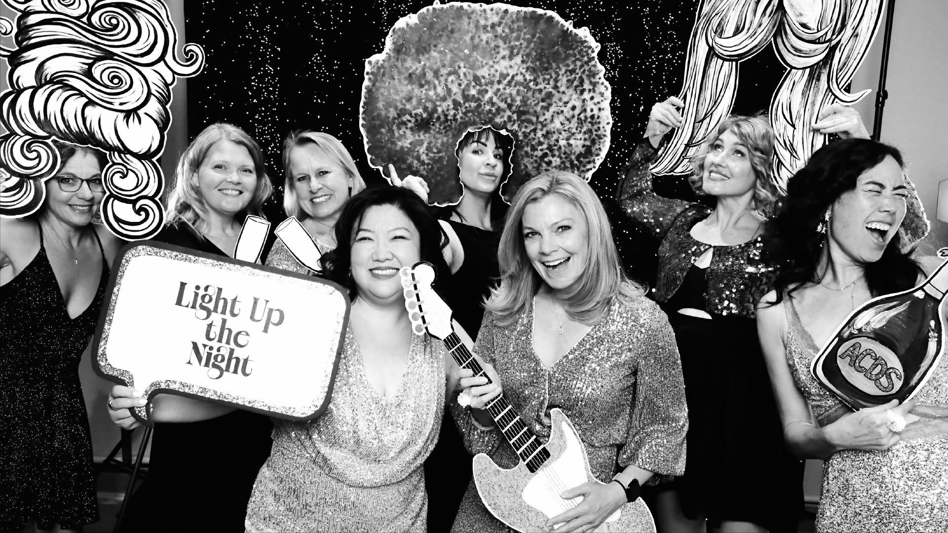
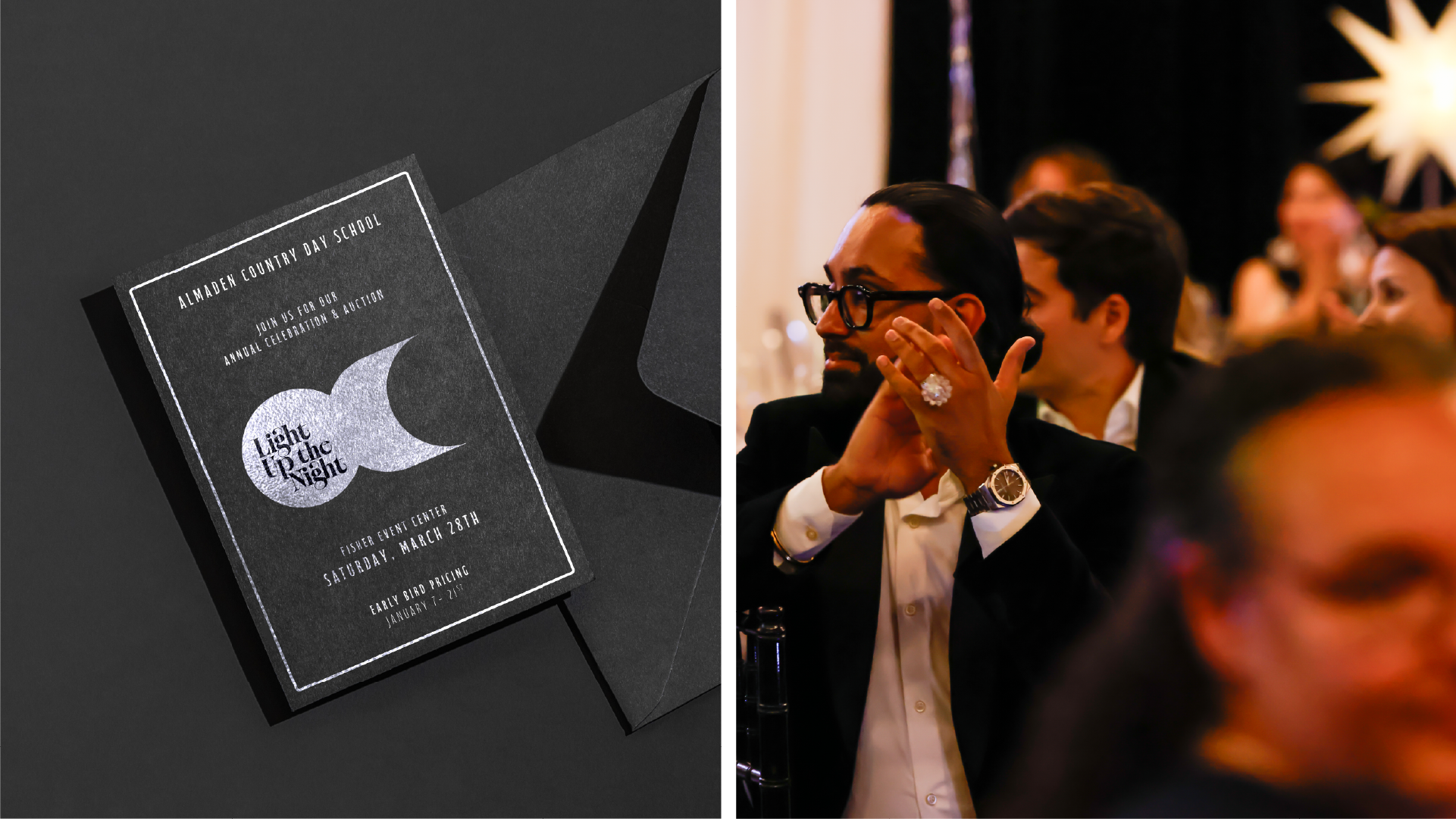
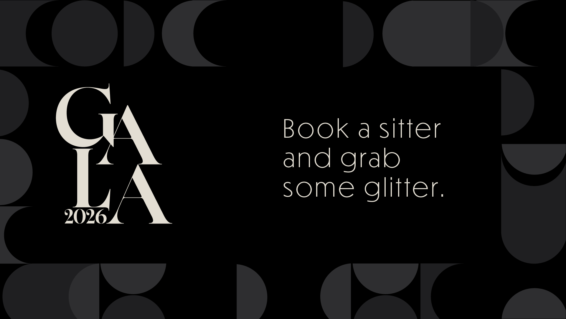
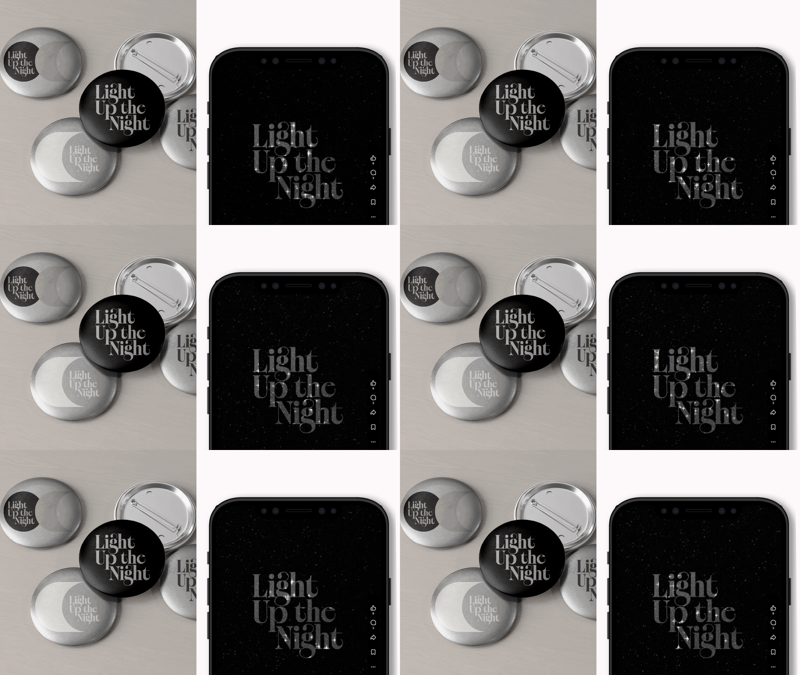
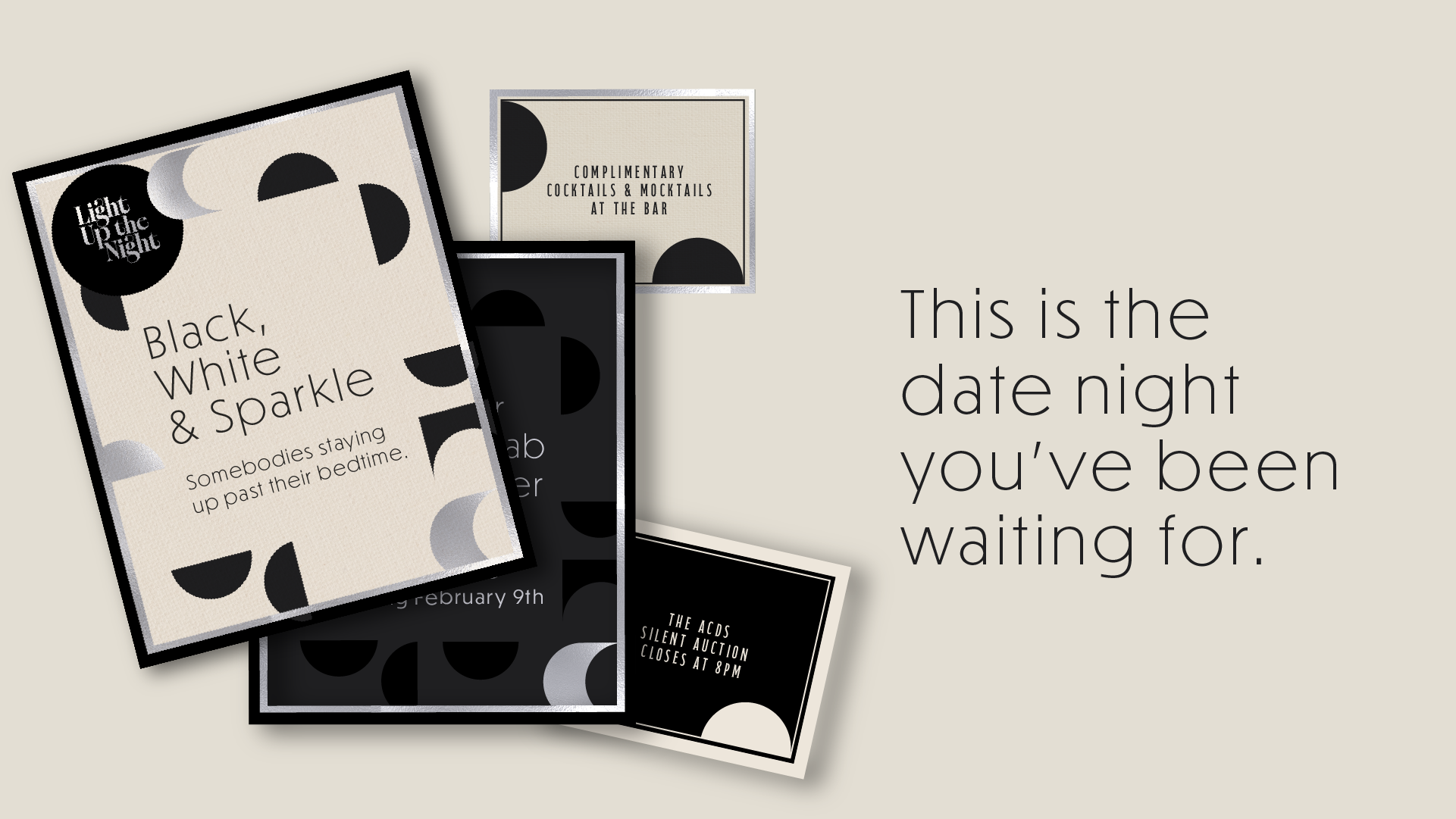
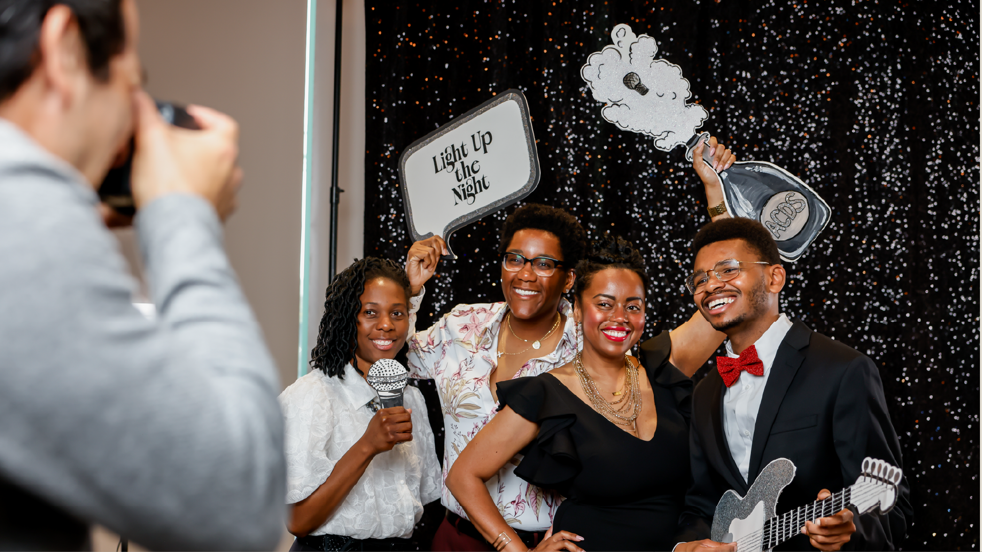
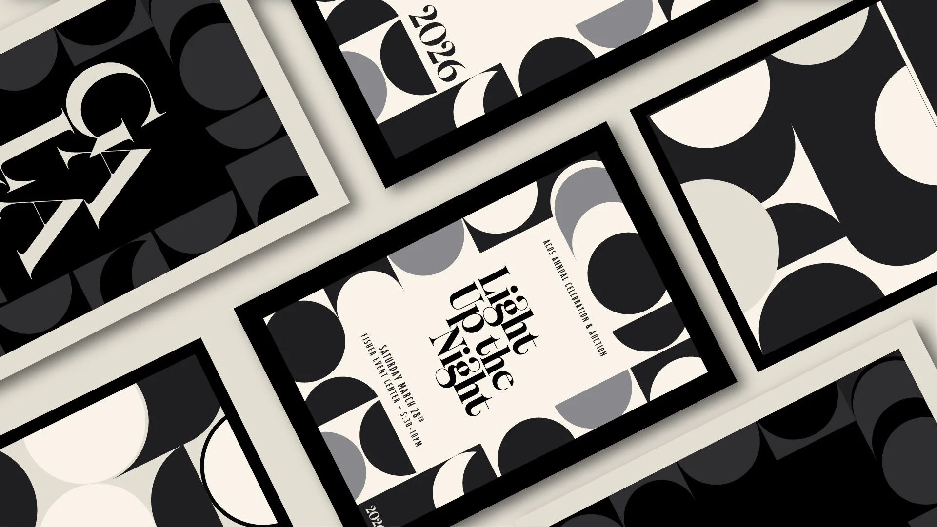
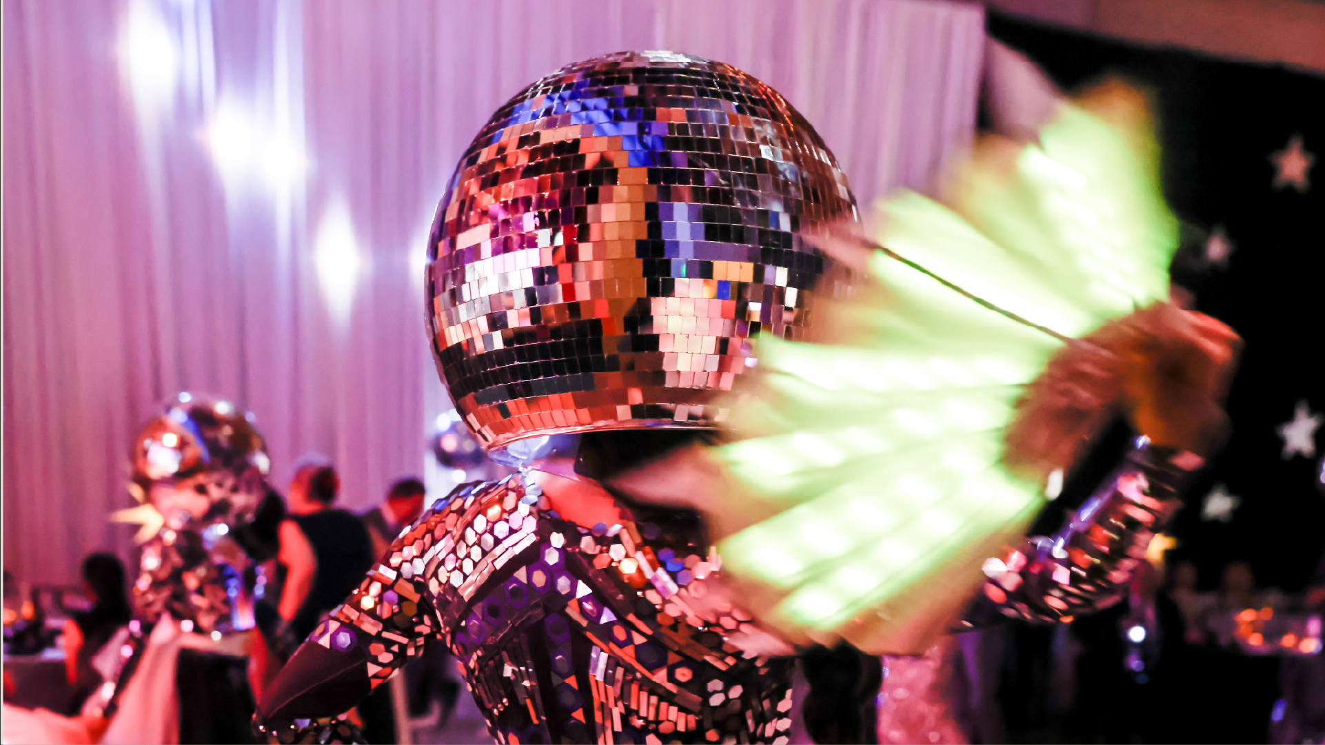
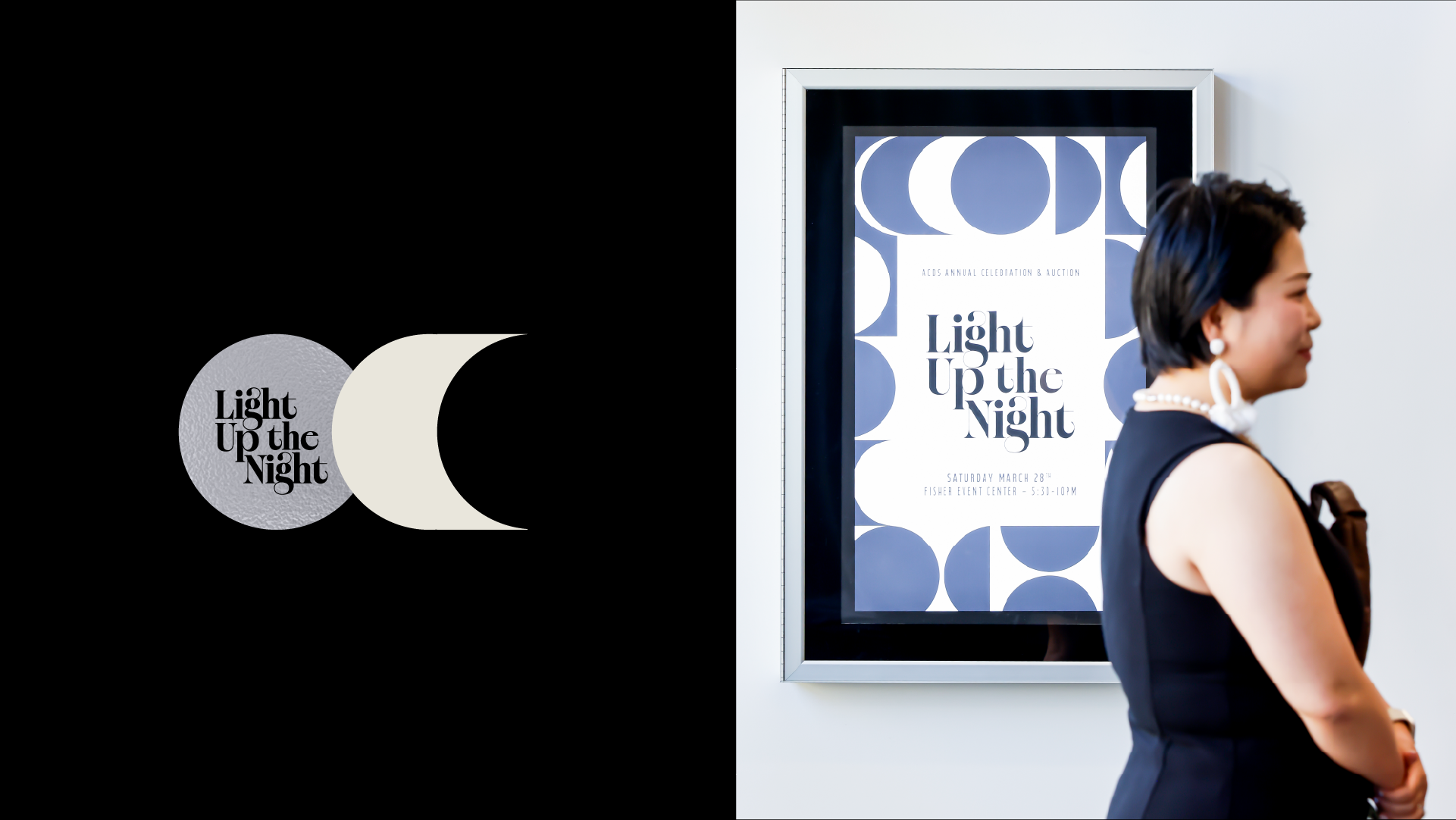
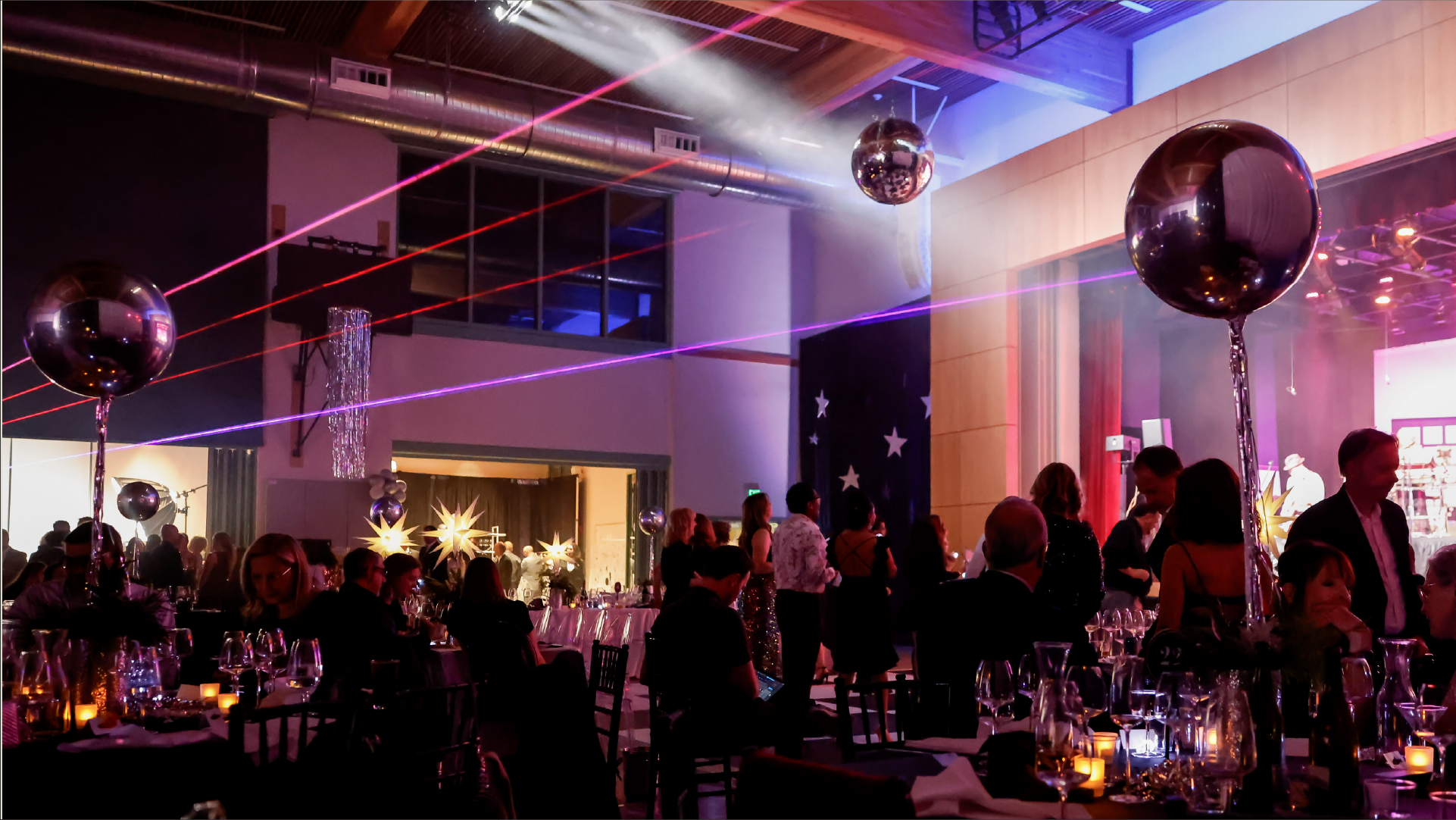
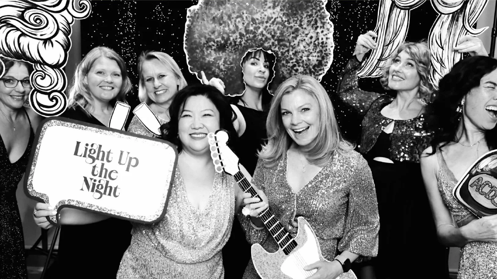
Designed to unify the school community, the brand identity for Almaden Country Day School’s primary fundraiser brought a cohesive visual world to life across every touchpoint. From core branding and social media to event collateral, floor plans, and auction signage, the unified experience boosted engagement in support of teacher funding and educational programs.
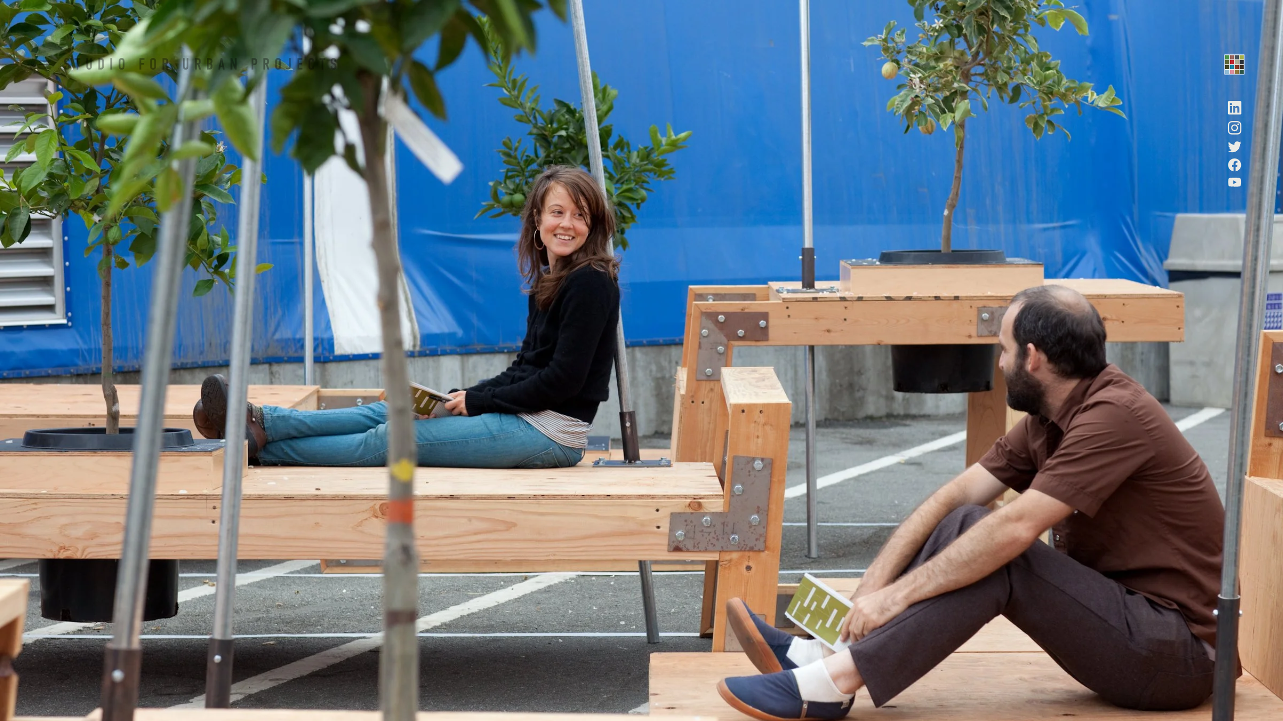
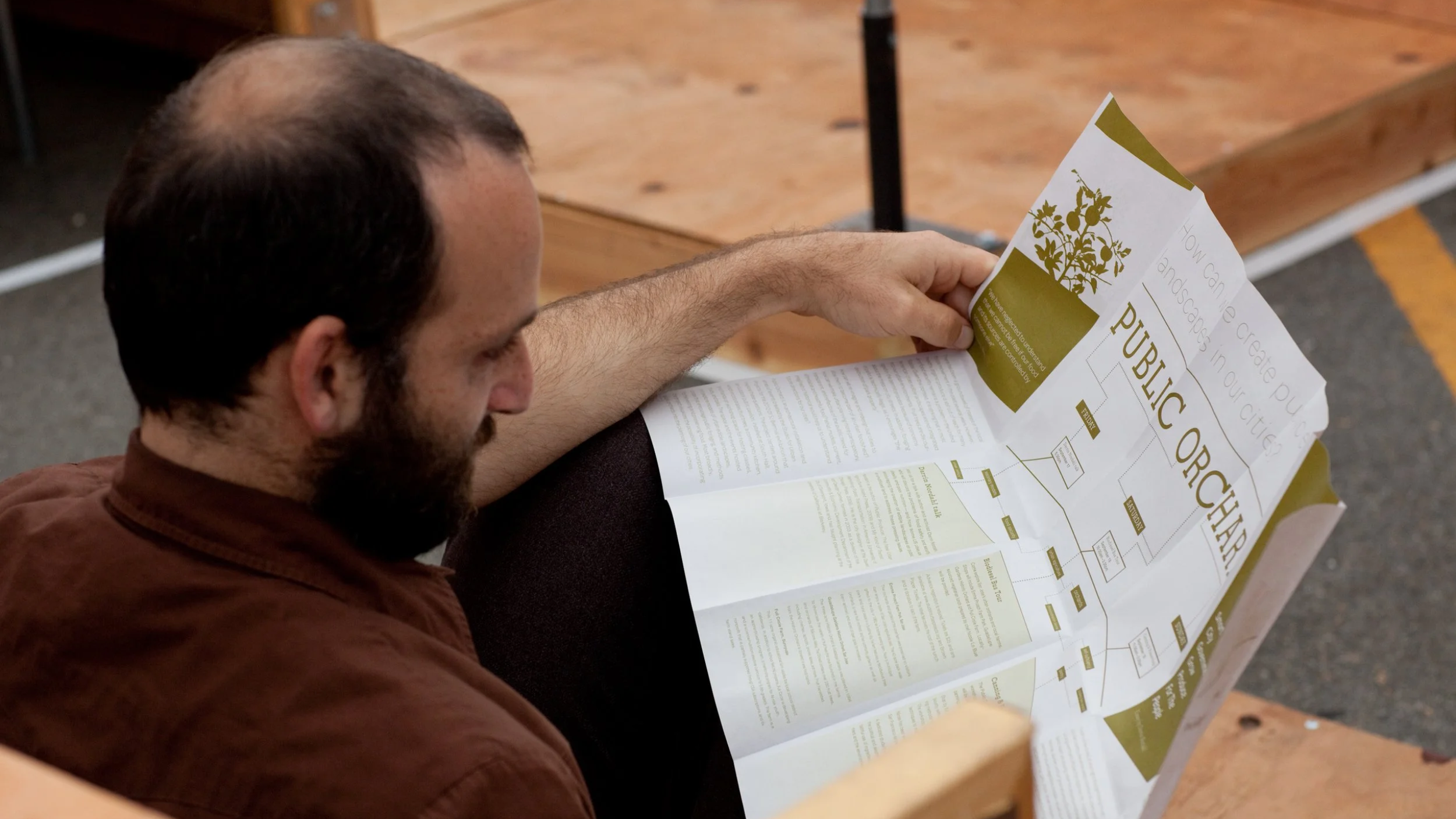
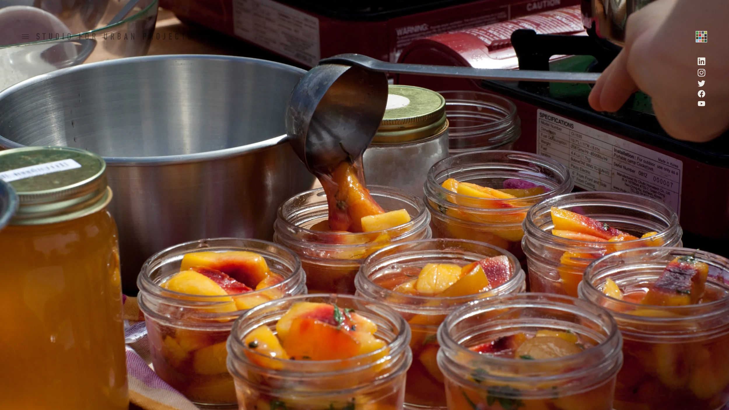
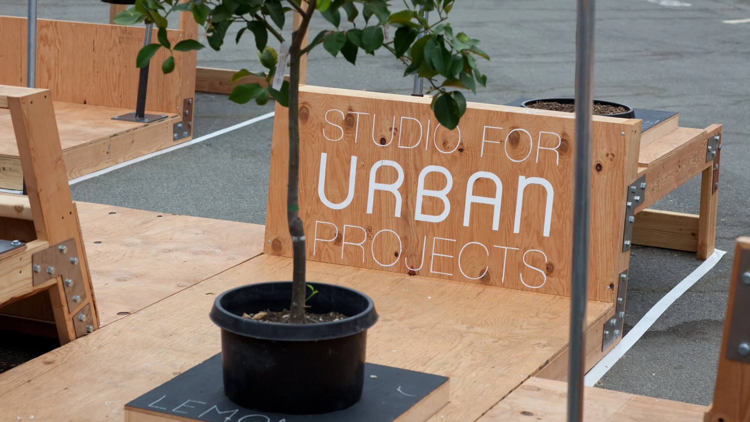
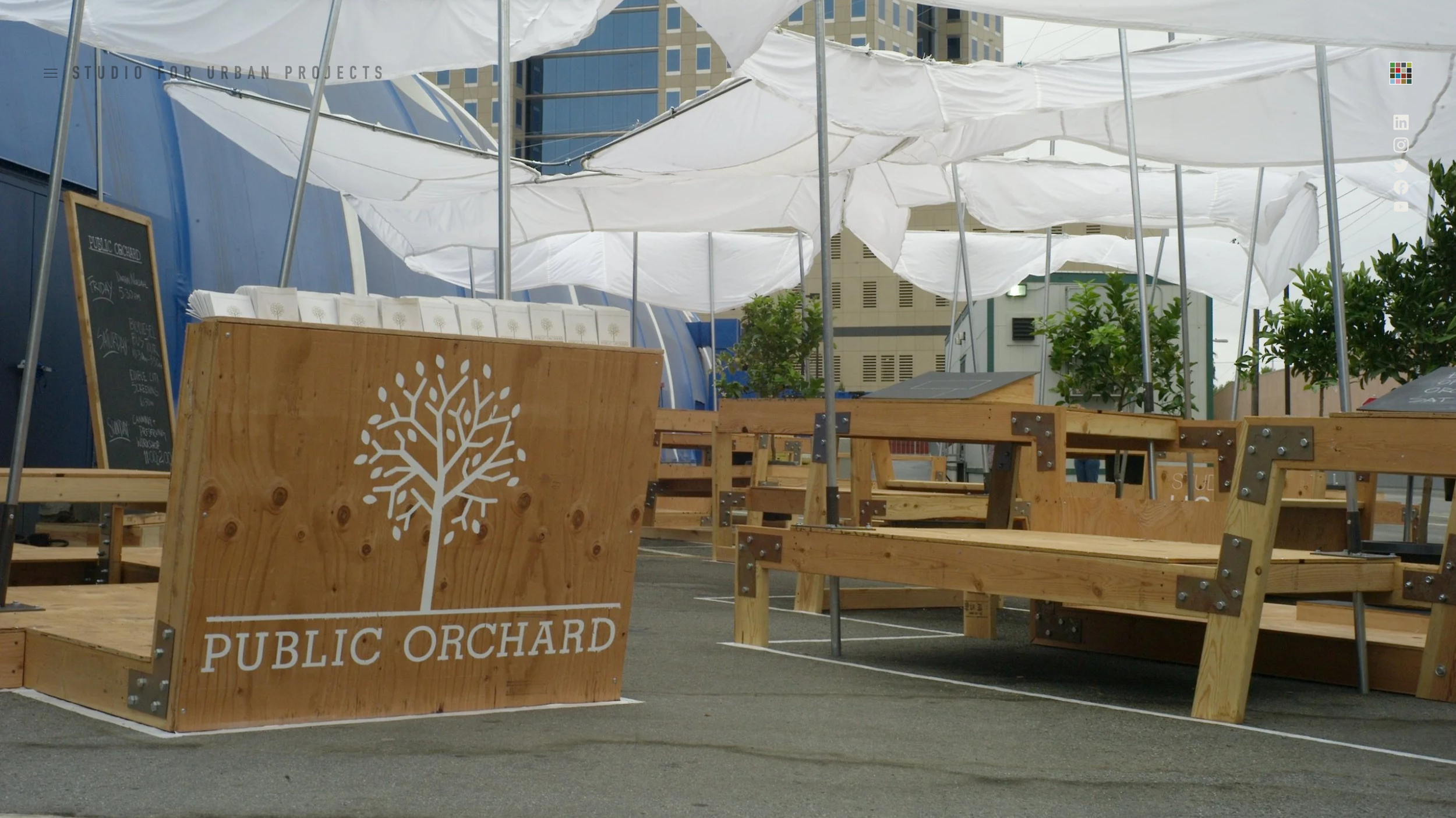
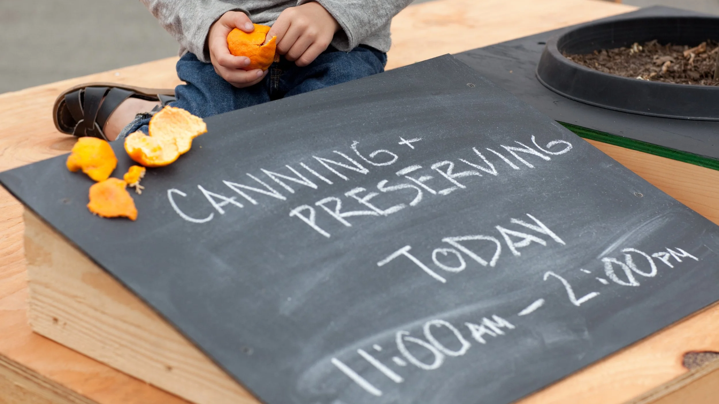
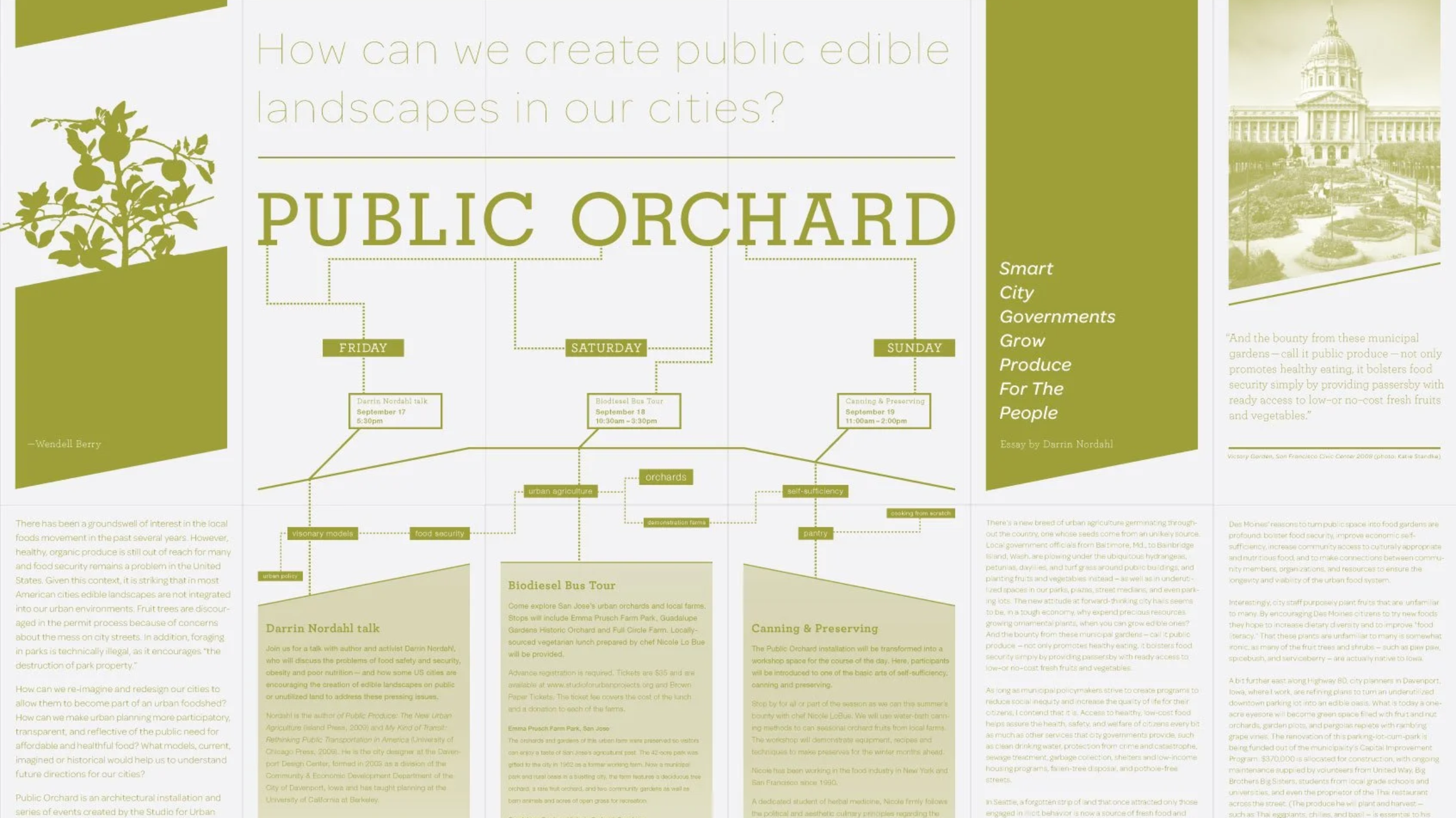
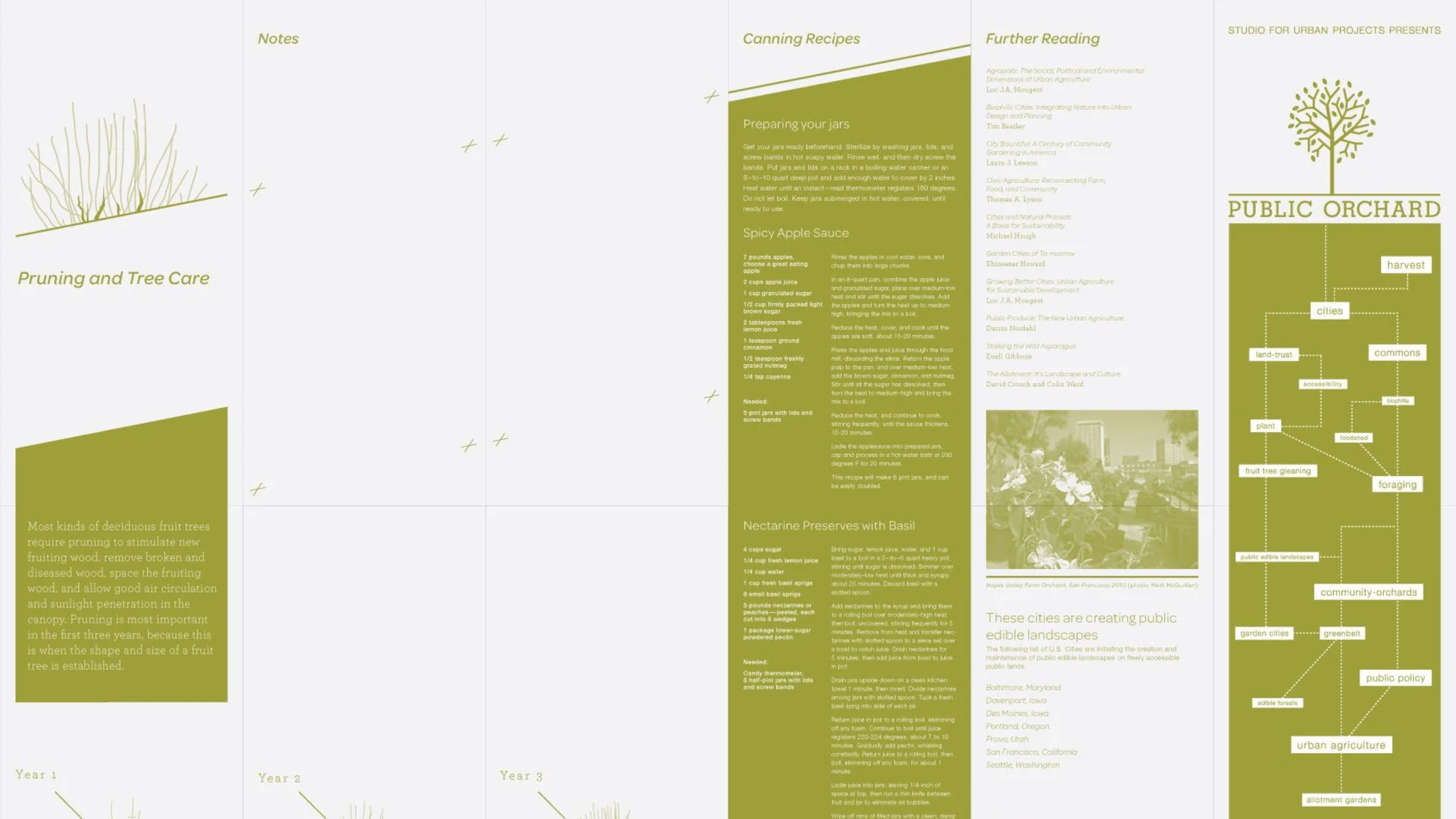
Designed for the 01SJ Biennial by The Studio for Urban Projects, this pavilion and public park activation engaged the community around food security and urban foodsheds. The programming included interactive talks, workshops, and film screenings, complemented by an educational takeaway guide covering event schedules and fruit tree care.
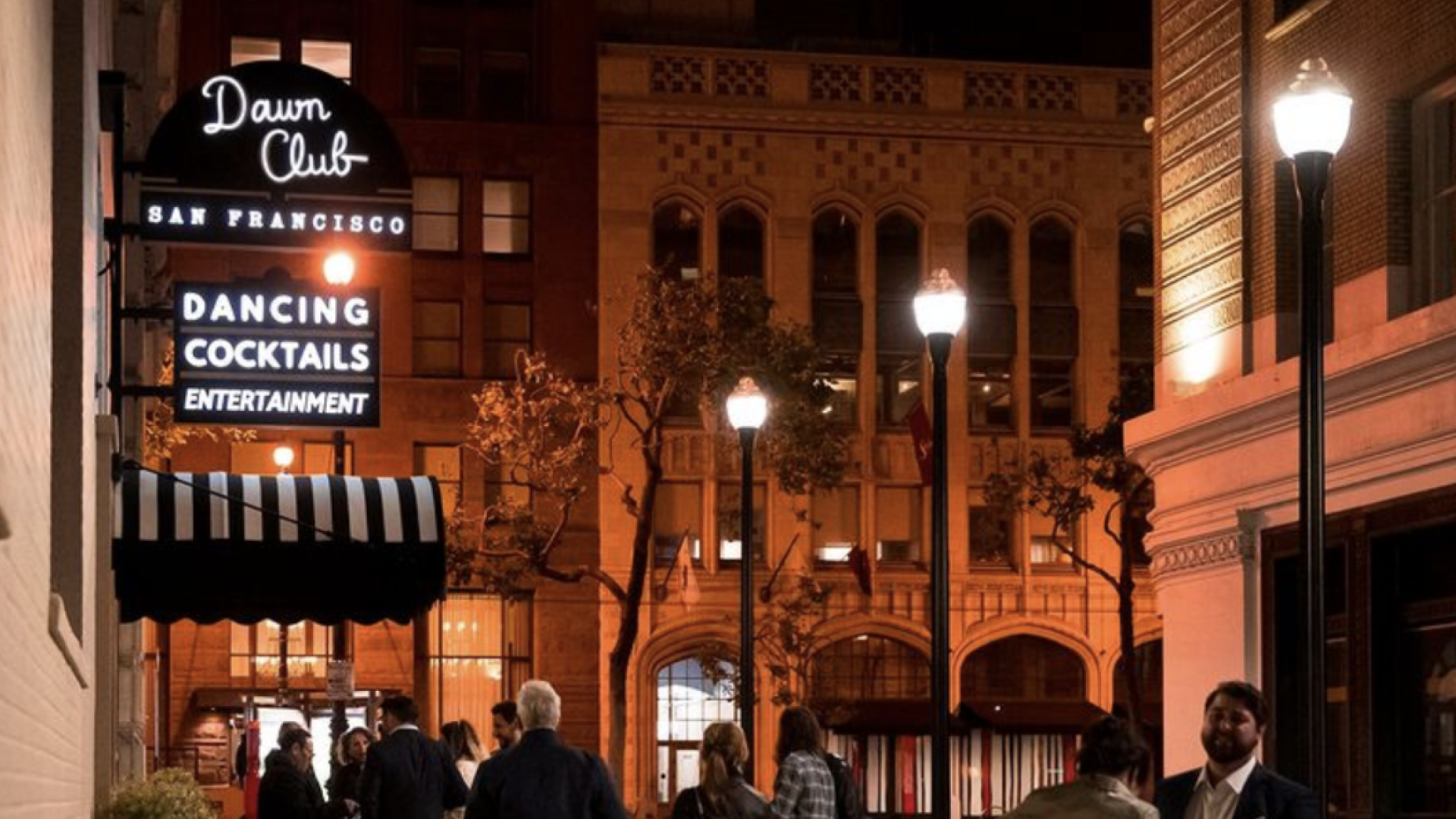
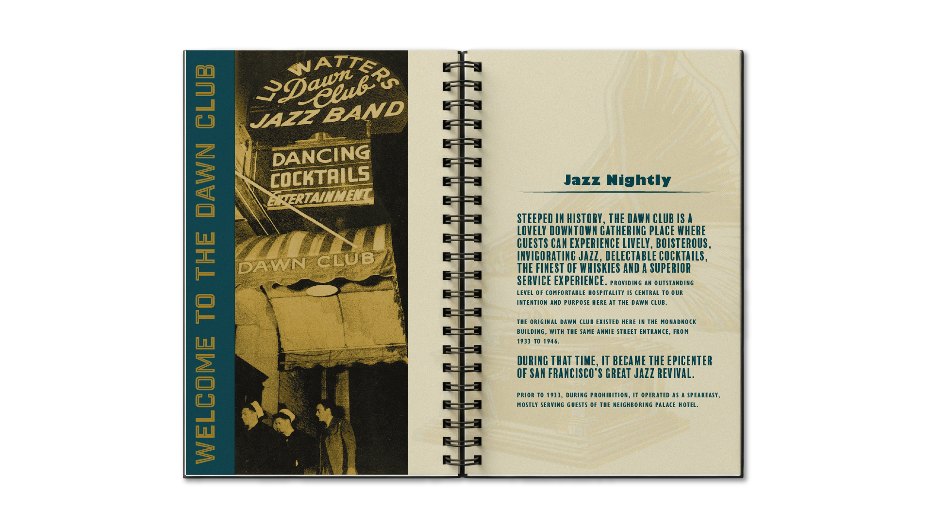
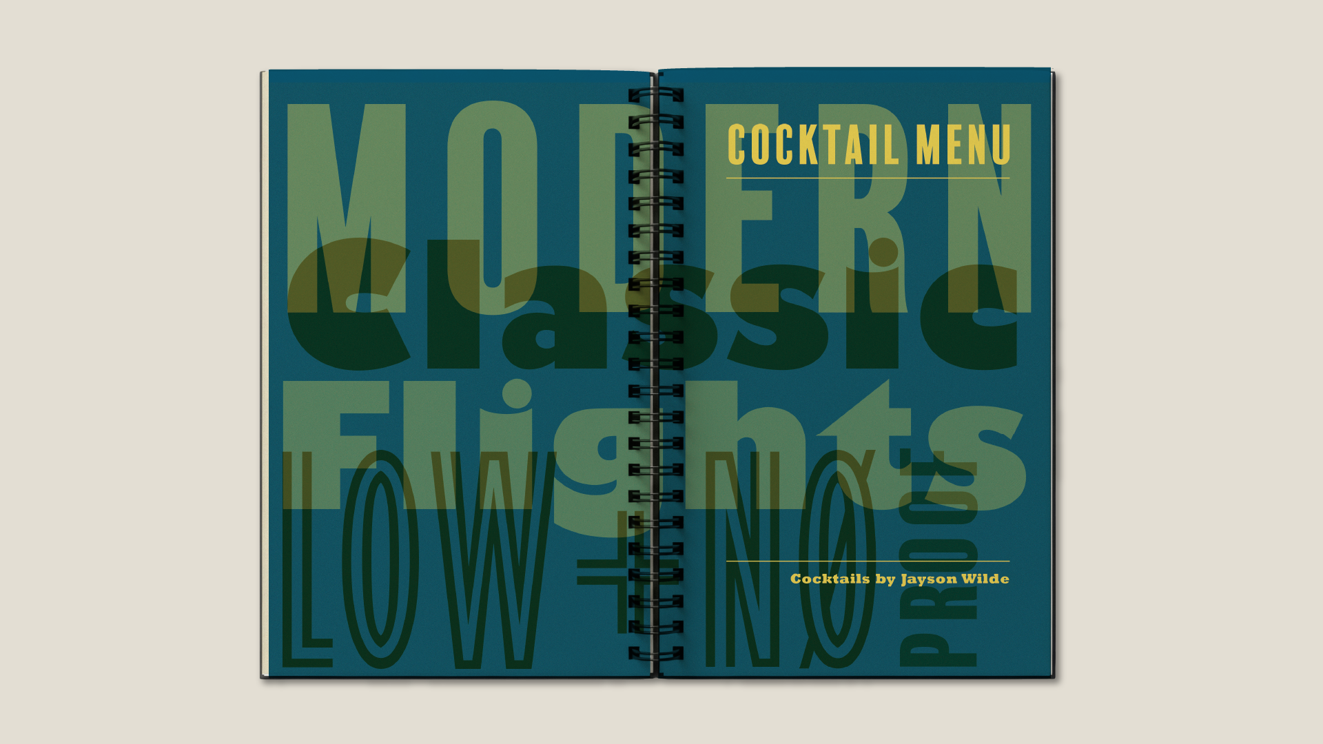
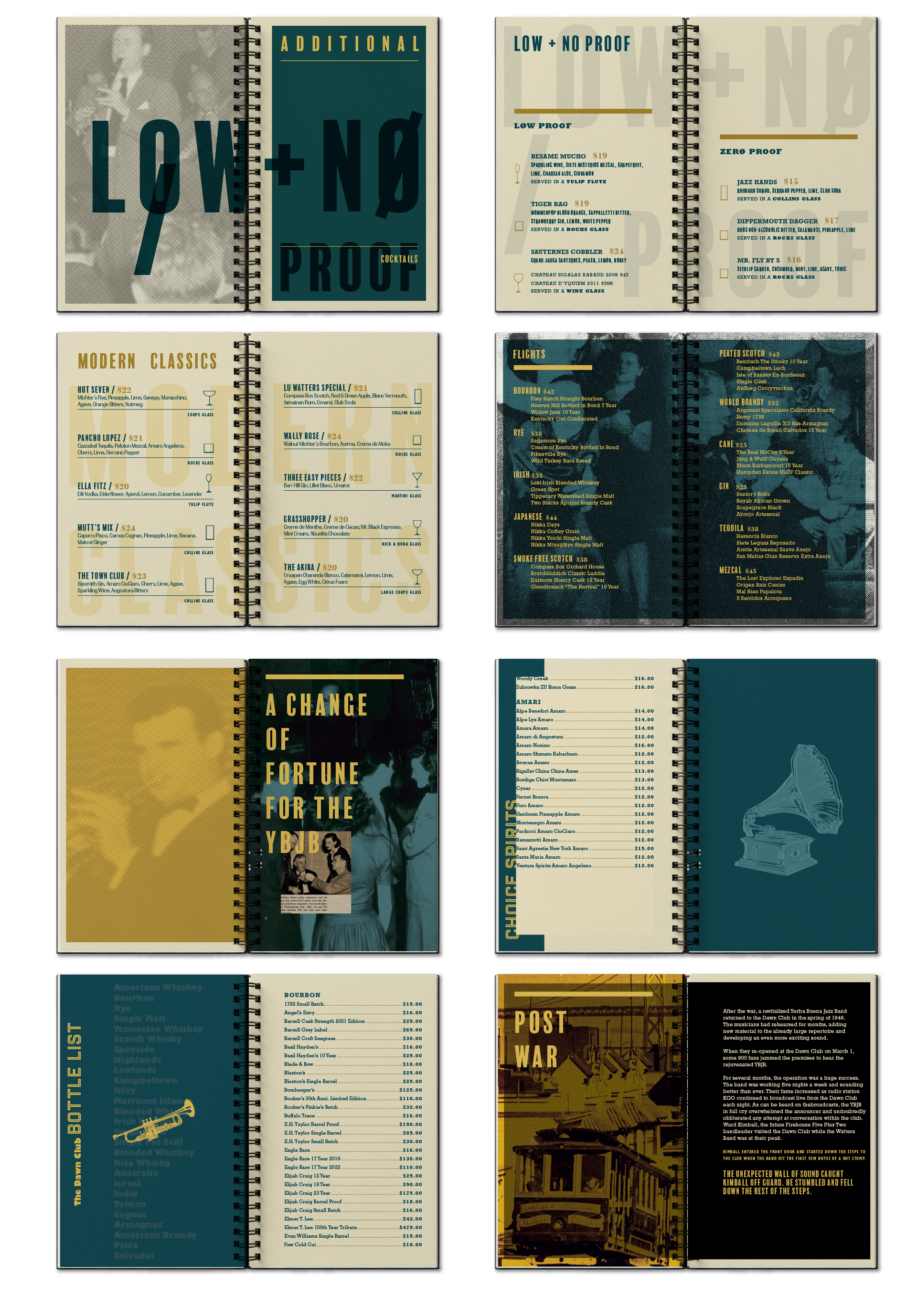
Invoking the original spirit of the Prohibition-era speakeasy, the reimagined identity of the Dawn Club draws from the visual language of the Jazz Revival—blending vintage typography, rich graphic textures, and cues from wartime-era music ephemera to create a sense of nostalgia without feeling dated.
The New York Philharmonic sought a new visual identity that could express the vitality of the orchestra, while also reflecting the distinctive character of New York City. The identity uses and expressive interplay of letterforms to create a feeling of motion, rhythm, and connection. Like an orchestra, the individual elements come together to form something larger—a visual system that feels dynamic, confident, and unmistakably alive.
An identity and website for a matchmaking firm that makes finding the right creative partner fast, curated, and approachable. The brand pairs clear, direct copywriting with a confident, flexible visual system designed to make the process feel simple and human. From the identity and website to the messaging and digital experience, every touchpoint communicates a friendly, open, and no-nonsense approach to connecting businesses with the right boutique and mid-sized agencies.
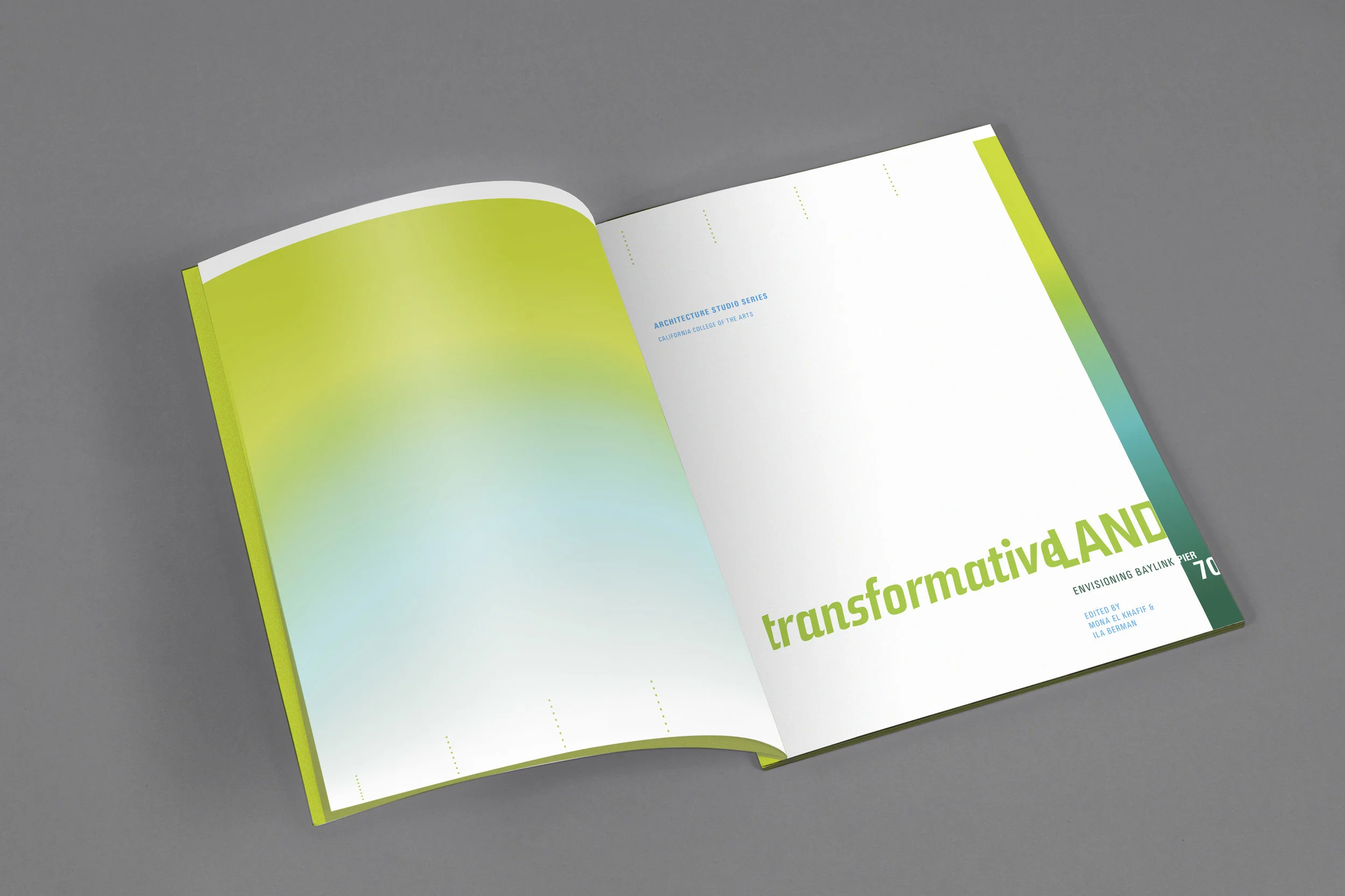
A book design for an interdisciplinary research center exploring the complex urban challenges of the 21st century through collaborative design and public planning. A chromatic navigation system organizes the publication by section, with each chapter assigned its own color to create an intuitive visual hierarchy and make the research easy to navigate.
The Symbio Employee Handbook was designed to reflect a culture built around exploration, curiosity, and idealism. It gives the team a shared framework for how they work, while leaving room to question assumptions, experiment, and discover what’s possible. We wanted the handbook to feel less like a rulebook and more like a guide for navigating new territory together. The result is a clear, approachable resource that balances practical guidance with a sense of optimism about the future.
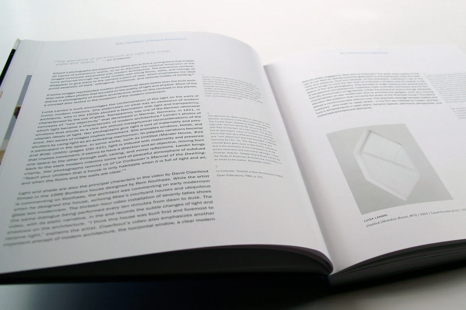
Revisiting the Glass House explores how contemporary artists use modern architecture to reconsider its utopian ideals. The book’s design extends these ideas through a rigid typographic grid inspired by modernist architecture. Typography and imagery are treated as architectural volumes, creating a visual language that mirrors the book’s exploration of order, space, and the possibilities of modernism.
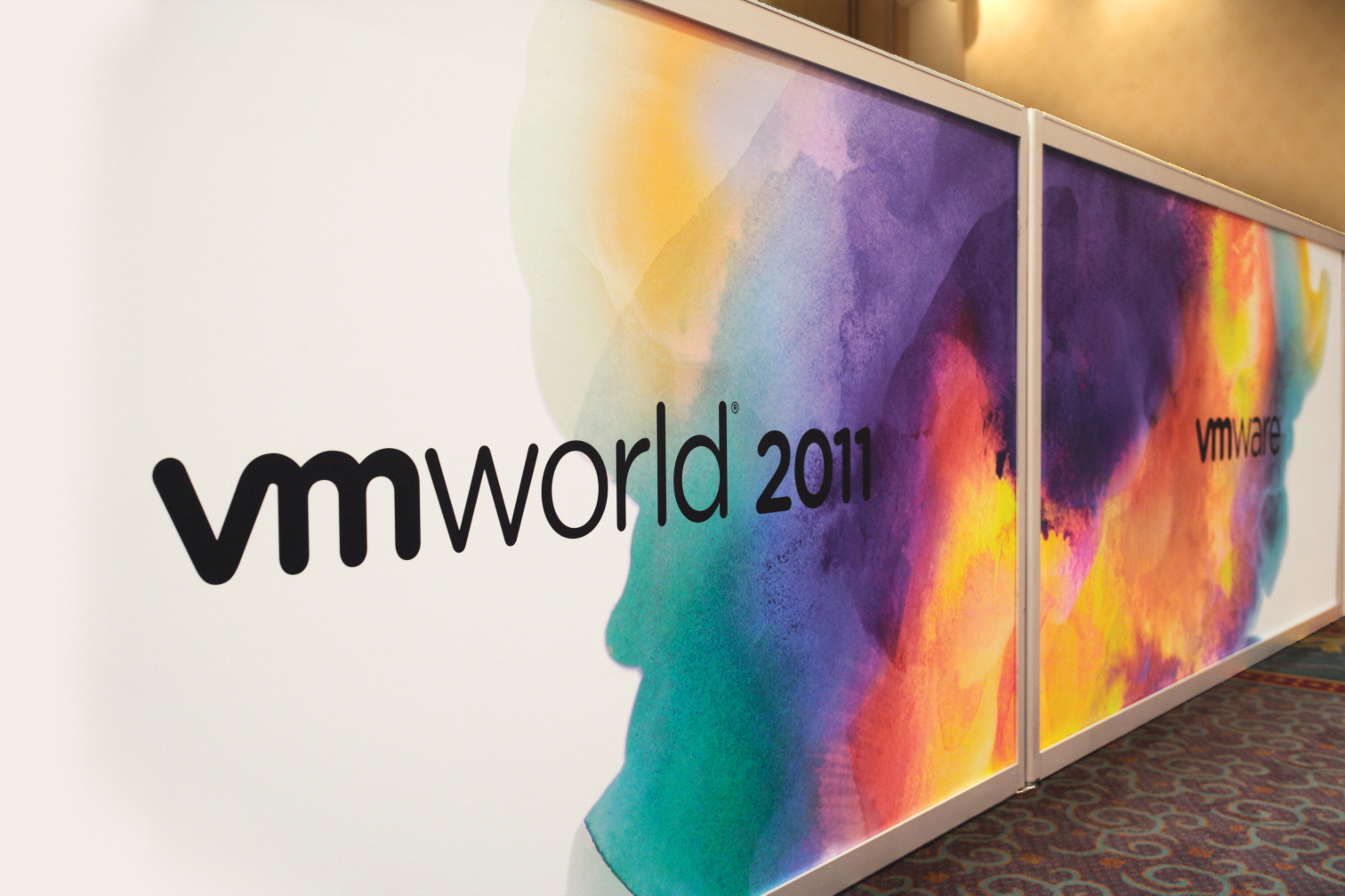
A brand identity that reimagines the cloud as a space where technology, data, and people converge. Fluid watercolor textures, amorphous cloud forms, and dynamic portraiture create a visual language that connects the limitless potential of cloud technology with the people shaping what comes next.